From favoring minimalist covers to singing the praises of a jacket with strong typography, designers can all agree on one thing: your book cover should tell a story. One that will act as invitation for readers to dive in and read the rest of it.

All artists draw inspiration from the art that they love. In this article, seasoned designers share their all-time favorite book covers — covers that not only do the marketing job of representing what the book is about, but that do it with style.
Centered Around Character
Picked by Emmeline Pidgen: Freelance illustrator specialising in character-based narrative illustration and book covers for children's books, young teen fiction, and lifestyle non-fiction.
“This is a very specific choice, but I absolutely love the cover of Saga: Volume 3 by Brian K. Vaughan and Fiona Staples (published by Image Comics). As the title suggests, it’s the third in the series of collected editions of the graphic novel Saga — a gorgeously illustrated and wonderfully written space opera.
The series has a lot of characters, but primarily revolves around a family who are actually not shown on this cover. It could be seen as unusual for a cover to not show its main anchoring characters, but with the covers of the other volumes focusing heavily on the family, Volume 3 chooses to feature Gwendolyn and Sophie, who are integral to this part of the story and will be familiar to readers of previous volumes. The story encompasses many threads, so it’s great to see different elements of Saga’s universe shown on the covers.
As an illustrator, designer and comic-creator myself, I’m often drawn to visually-based covers that give a strong sense of character, narrative and world-building — as I like to do in my own work. This cover in particular has elements which instantly communicate the strength and curiosity of the characters, the setting (look at those moons!), strong compositional elements, Fiona Staples’ technical skills, all alongside a gorgeous colour palette!”
Why this kind of cover works: There is much debate when it comes to featuring characters on a book cover. Many opponents of it feel it imposes the author’s image of the characters on the reader. This might be true in some cases, but there are circumstances (and genres) when a glimpse of the protagonist works. For instance, it is not uncommon for children’s fiction, YA, romance, science fiction, and fantasy novels to display characters on the book jacket. Here are a few more examples of covers that introduce us to characters straight off the bat…

Typography that signifies time period
Picked by Ros Welply: Lead Designer and Creative Director of The Book Design Factory.
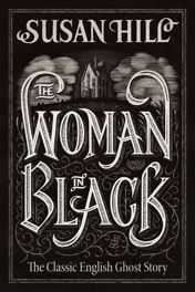
“My favorite cover of all time is a cover for the traditional English ghost story The Woman in Black by Susan Hill, cover by Jamie Clark.
The cover perfectly captures the Victorian aesthetic through the colours and style of the illustration. The illustrations are also not too overbearing and nicely complement the typography.
From a marketing standpoint, this cover is centered around the title, which is big enough to be seen from a distance or as a thumbnail, perfect for displaying the book in stores or on websites. Readers who appreciate ghost stories will also easily be able to relate to this cover with its gloomy undertones.”
Why this kind of cover works: If your book has an emphatic title that conveys the subject, sometimes using the book cover to emphasize that is the best way to attract readers — which is why many designers opt for strong, typographic covers. Here are a few more examples of covers where the title is the main show…

Illustrations that set the tone
Picked by Helen Huang: Published Illustrator specialising in young adult and children's book covers, picture books and more.
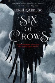
“I really love the book cover for Six of Crows, written by Leigh Bardugo (cover designer unknown!).
It’s perfectly executed by setting the tone and mood of the story, with the subjects of the illustration and the color scheme. The dark grey clouds and the black crow indicate danger and uncertainty. The use of negative space for the buildings is brilliant.
The choice of font for the title is elegant yet playful in a very inviting way that draws readers in to explore the world. A high-quality book cover gives a great first impression and plays an essential role in marketing the book — especially online where a potential reader's attention can be hard to keep.”
Why this kind of cover works: When you think of iconic book covers, it’s likely the ones that spring to mind are illustrated. Just think of The Hobbit, The Great Gatsby, The Catcher in the Rye, Fahrenheit 451, so on and so forth. Hand-drawn covers can be incredibly versatile, and can give a book that extra special first impression it needs to convince readers to pick it up. Here are a few more examples of covers where an illustration sets the tone for the story...

Evocative minimalism
Picked by Roberta Zeta: Italian illustrator, specialising in YA and fashion illustration, whose previous clients include HarperCollins, Bellini, Saatchi&Saatchi.
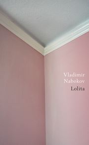
“My favourite book cover of all time is the one designed by Jamie Keenan for Nabokov’s Lolita.
I find it incredibly smart and amusing: it can speak about the subject of the book in a light way, without showing any flesh, and it’s perfectly aligned with Nabokov's writing: a fun hint of the erotic passion that haunts the main character.
In images and shapes such as trees, shadows, and objects in general, we can see and fantasize about the body. We can immediately relate.”
Why this kind of cover works: On minimalist covers, the elements displayed tend to allude to the subject of the book rather than stating it outright. This can be attention-grabbing in many ways: sometimes, as is the case with the cover of Lolita, readers do a double-take; while other times, readers glance at a cover only to have an “Ah-ha!” moment when they “get” what the cover is trying to say. French writer Antoine de Saint-Exupéry, explains the attributes of minimalism best: “A designer knows that he has achieved perfection not when there is nothing left to add, but when there is nothing left to take away.” Here are a few more examples of covers that use a little to convey a lot...

If this isn't enough motivation, here are 68 more book cover ideas for you. We hope that this post has inspired you - whether you're dreaming up the cover for your own book, or simply revisiting your bookshelf and taking in familiar covers in a new light.
Reedsy was founded in the summer of 2014 by Emmanuel Nataf, Ricardo Fayet, Vincent Durand and Matt Cobb. Since then, they've built a network of world-class publishing professionals and helped produce over 3,000 books. Visit their website here.
Comments